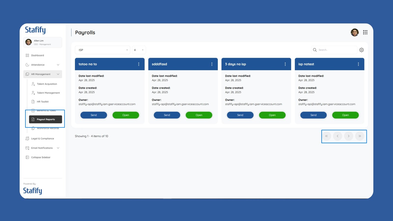
Today I started a major rebranding effort for the HRIS system to accommodate multiple clients under different subscription tiers. The primary objective was to create a neutral, professional design that could serve as the default branding for those subscribed to the Lite version.
In the Lite subscription, clients won’t have access to custom branding, so it was essential to create a clean, black-and-white theme that still feels premium. I revised the global CSS variables and introduced a grayscale palette to be applied consistently across pages.
This involved stripping out custom logos, vibrant accent colors, and unique font styles from the base theme. In their place, I implemented a minimalist design language with ample spacing and sharp typographic hierarchy.
It was a challenge ensuring that this branding looked “intentional” rather than “default.” I focused on balance, iconography, and subtle shadows to maintain elegance even with restricted color use.
I also added a detection system that automatically applies the neutral theme when a Lite subscription is detected, without affecting clients on higher tiers.
With this change, companies that use our system under the Lite plan get a consistent and professional experience while encouraging upgrades for more personalized branding control.

